
A user sits down at their laptop in a branch office. They click once to open a business application that lives somewhere in AWS.
That click is not a click. It’s a relay race. The packet leaves the laptop, hits the SD-WAN edge in the branch, rides MPLS to an SD-WAN hub in a co-location data center, traverses a security stack, threads through leaf-spine switches, hops the gateway routers, crosses into the cloud, transits the AWS backbone, lands in the right VPC, and finally talks to the application server. Then the response has to come back through a reverse path that may not even match the forward path, because asymmetric routing is a real-world phenomenon, not just something on a CCNP exam.
That was one click. From one user. On one application.
Now imagine it breaks at 2 AM. Who’s on the call?
The Bridge Call From Hell
You know who’s on the call, because you’ve been on the call.
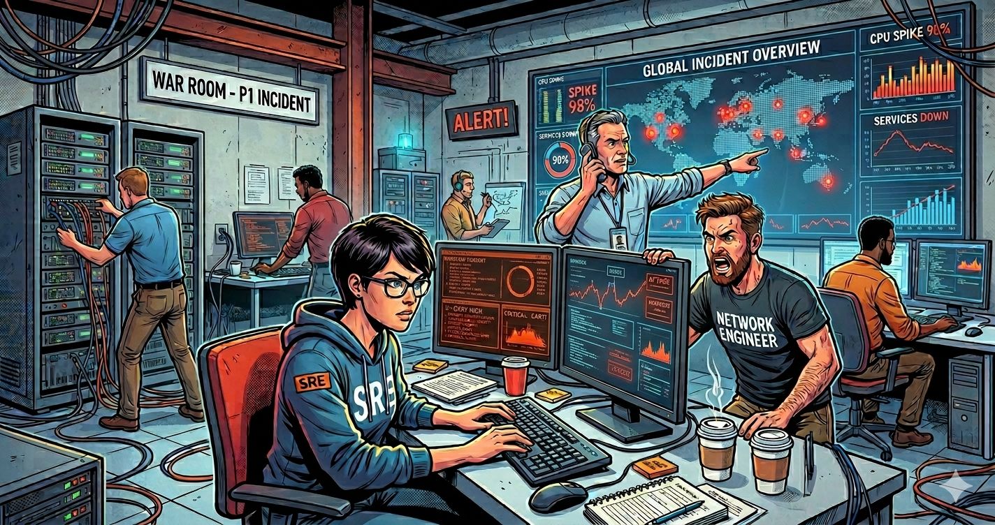
The network engineer is on. The cloud engineer is on. Someone from security is on, because nobody knows yet whether a firewall policy pushed at 11 PM is the culprit. A DBA shows up because the app team paged them. The app owner is on, mostly to ask whether anyone has fixed it yet—six people, five Zoom tiles, one slowly cooling pot of coffee.
Every one of them has a different dashboard open. The network engineer is looking at SNMP polling data and BGP tables. The cloud engineer is in CloudWatch. Security is checking the firewall logs. The app team is staring at APM. The DBA is watching query latency. And the user, somewhere, is still clicking the button.
Varija Sriram from Selector said it best when they presented at Network Field Day a few weeks ago: “Every single domain is screaming its own language.” She wasn’t exaggerating. Network’s tool says everything looks clean. Cloud’s tool says AWS is green. Security says no policy changes in the last 24 hours. The app team says staging is healthy. And the user still cannot load the app.
Two hours in, somebody finally notices that one optical circuit in Tokyo is degraded, and that’s been quietly blocking the AWS Direct Connect path the entire time. The fix takes five minutes. The bridge call took four hours.
The outage cost the company money. But the bridge call cost them a lot more, in payroll, in delayed product launches, and in the quiet erosion of trust that happens every time IT can’t tell the business what’s wrong.
The Holy Grail We’ve Been Chasing for Decades
If you’ve been in this industry long enough to remember when “the network” meant a building, you have been pitched the single pane of glass.
It is the holy grail of IT operations. It was a term long before I had gray hair. HP OpenView promised it. CA Spectrum promised it. Tivoli, NetIQ, SolarWinds, ServiceNow, every cloud-native APM darling of the last decade, all of them promised it. Pick a decade, pick a vendor, the pitch was the same: one console, one view, one truth.
And every single time, what we actually ended up with was more dashboards, not fewer.
Why? Because each new vendor assumed that THEY were going to be the single pane, and your other eleven tools were going to politely die so they could be the survivor. That never happened. Nobody rips out their NetFlow analyzer because their cloud monitoring tool added some half-baked flow analytics. Nobody fires Splunk because their SIEM vendor of the year tacked on log search. Nobody decommissions the NMS that the senior engineer built their career around just because the new platform has nicer graphs.
So every single pane of glass purchase ended up being the thirteenth pane. Not the only pane.
We’ve been complicit in this, by the way. I’m not going to pretend we’re innocent victims of vendor marketing. We wanted the new tool to be better than the old one. We just also kept the old one, because what if we needed it, or because we already paid for the year, or because Bob in operations really likes it, and Bob is hard to argue with. So the stack grew. It always grows.
The Dashboard Spiral, By the Numbers
At Network Field Day, Reza Koohrang from Selector dropped a stat that I haven’t been able to stop thinking about. He said his Fortune 1000 customers are running 12 to 15 observability tools on average. Each one shows what he called “a partial view” of the same incident. Each one fires its own alerts. A single incident, he said, can spawn anywhere from 10 to 1,000 alerts across that toolchain.
Varija put a finer point on it. Today’s NOC operators, she said, don’t suffer from a lack of observability. They are drowned in alerts. They are drowning in observability.
Now I’m not running a Fortune 1000 environment, and most of the people reading this blog aren’t either. But before you wave that number off as somebody else’s problem, do a quick count of what your shop is actually running. SNMP poller. NetFlow collector. Syslog server. APM. Cloud-native monitoring on each of your three clouds. The SaaS thing your MSSP installed. The thing the consultants installed last year that nobody remembers how to log into. The thing the security team uses but won’t let you see. The vendor-specific dashboard for your firewall, another one for your switches, another for your wireless controller.
If you’re at six to nine tools with overlapping coverage and none of them tell you the same story about the same incident, congratulations, you have a smaller dose of the same disease. The dashboard spiral doesn’t care about your company size. It just shows up in proportion to your stack.
Stop Fighting the Tool War
Here’s where Selector reframed the problem for me, and honestly, it’s the smartest thing I heard during the whole presentation.
The problem isn’t the 12 tools. The problem is the 12 data silos that those tools are sitting on top of.
Reza said it directly: the root cause of everything is the fragmented data, not the tool count. Each tool ingests its own telemetry, reshapes it on the way in to fit its own schema, strips out whatever context didn’t fit, and locks the result inside its own proprietary database. So when the network’s tool sees a BGP flap, and the cloud’s tool sees a VPC reachability issue, and security’s tool sees nothing at all because nothing security-related happened, none of those data points can be correlated automatically. They live in three separate databases with three incompatible schemas. The correlation has to happen inside the head of a tired engineer at 2 AM.
And that reframe matters because tool consolidation, as we’ve already established, is almost always politically impossible. The guy who picked Tool #7 still works here. The Tool #4 contract has 18 months left on it. The security team will not let go of Tool #11 because their auditor wrote it into last year’s SOC 2 report. The cloud team’s Datadog spend is locked in for two more years and the CFO already signed it. You are not going to win the tool consolidation war.
So stop fighting it. Fight the data consolidation war instead.
How You Actually Consolidate the Data
The way Selector pitched it, and to their credit, the way the demo backed it up, is this: you don’t have to rip out your existing tools. You collect FROM them, alongside the raw telemetry, into one horizontal data lake.
The word “horizontal” matters here. Most observability platforms are vertical silos by design. One architecture for network, one for cloud, one for infrastructure, one for apps. Selector argues that’s the original sin of the whole category. You need one architecture that ingests all of it, regardless of domain, vendor, or source.
Then comes the part that sounds boring but is actually the whole game: ELT versus ETL.
Jargon Box: ELT vs ETL
ETL (Extract, Transform, Load) is the traditional data pipeline. You pull raw data from a source, reshape it on the way in to fit your destination’s schema, then load it. The transform happens before the data lands. Good for clean dashboards. Bad for cross-domain root cause analysis, because the transform step usually drops the timestamps, source metadata, and raw values you might need later when you don’t yet know what question you’re going to ask.
ELT (Extract, Load, Transform) flips the order. You pull raw data, dump it into a data lake as-is with full context intact, then transform it later when you actually know what question you’re trying to answer. Modern observability and AIOps platforms increasingly use this pattern because it preserves the cross-domain context that real root cause analysis depends on.
Most observability tools do ETL. They reshape data on the way in. That works fine for dashboards, because the dashboard was the question you were optimizing for when you designed the schema. It is terrible for cross-domain root cause analysis, because the transform step strips out exactly the context you’d need to line up a network event, a cloud event, and a layer 1 optical event on the same timeline six hours later.
Selector does ELT. Raw data lands first, with timestamps and source context preserved. Transformation happens later, in context, with all the other data already sitting there next to it. That sequencing is what lets a correlation engine line up a BGP flap, an optical degradation, and a VPC reachability problem on the same timeline and figure out which one caused the others.
The demo proof point landed pretty hard, too. In the Tokyo-to-AWS walkthrough, Varija went from “Slack alert about unreachable financial applications” to “the XEO circuit in Tokyo has optical degradation, here’s the Jira ticket, here’s your next action” in roughly the time it took her to type the questions into the chat window. Synthetic probes, routing data, layer 1 optical telemetry, layer 2 interface errors, cloud transit gateway state, all correlated into a single incident with a single root cause and a single action plan.
The Honest Caveats
None of this is magic, and I’d be doing you a disservice to pretend otherwise.
A horizontal data lake doesn’t fix bad metadata. If your interface naming is inconsistent, your circuit IDs live in a spreadsheet nobody has updated since 2021, and half your devices are tagged “switch” because somebody got tired of typing, no correlation engine on earth is going to save you. Varija was explicit about this at Network Field Day. Most of their successful customer deployments, she said, start with a workshop to clean up metadata hygiene before they even turn the platform on. That’s a real cost, and it’s a cost most vendors are quieter about than they should be.
It also requires real onboarding work. This is not a plug-and-play SaaS where you point it at your stack and revenue starts dropping out the bottom. Every customer engagement Selector described involved hands-on collaboration to map naming conventions, interface metadata, and customer-specific business logic. That’s good, because the alternative is a cookie-cutter deployment that misses everything that’s unique about your environment. But it’s also a thing you need to budget for.
And there’s the obvious paradox you’ve already spotted: you wanted fewer tools, and the answer involves adding another tool. You now have thirteen. The argument is that this thirteenth tool eats the integration work the other twelve refused to do, but it is still a thirteenth tool, with its own contract, its own learning curve, and its own way of being on fire at 2 AM.
That tradeoff is real. Whether it’s worth it depends entirely on how much your 2 AM bridge calls are actually costing you. For most of the midsized IT shops I talk to, the honest answer is more than they admit out loud, even to themselves.
Final Thoughts
The single pane of glass was always the wrong target.
We were looking for a tool that would replace all the other tools. That was never going to happen. Vendors don’t die, contracts don’t end on time, and the political cost of consolidation has always been higher than the engineering cost of just buying another tool and pretending this one will finally be the answer.
What we actually needed all along, and what most of us have been too busy fighting the tool war to see, was a shared data layer underneath the tools. One that ingests everything we already have, preserves the context, and lets us correlate across domains without forcing anyone to rip out their favorite dashboard. The dashboards can stay. The data needs to start talking to itself.
Whether Selector turns out to be the platform that finally delivers on that, I genuinely don’t know. They were one vendor at one event, and the AIOps space is crowded with companies making similar pitches with different architectures. What I’m sure of is that the question is worth asking the next time a vendor walks into your office and tells you they’re going to be your single pane of glass.
Ask them what they do with the other twelve panes. If the answer is “we’re going to replace them,” walk them out. They are selling you the same disappointment you’ve been buying for thirty years. If the answer is “we ingest from them and unify the data underneath,” at least keep listening.
That’s the only version of the holy grail that has ever actually existed. And it took us thirty years of dashboard spirals to admit it.
I attended Selector’s presentation at Network Field Day as a delegate. Tech Field Day covered my travel and expenses. No vendor reviewed or approved this post before publication, and the takes are mine alone.


1 thought on “Twelve Tools, One Outage, Zero Shared Truth: The Real Cost of the Dashboard Spiral”